...having issues getting a link to download to full size in blogger :/ - so if you know how to do so, please share ;) or message me and I can send you one if you want to use it as your background :)
Monday, January 31, 2011
Honeysuckle 2011.
If you haven't heard already, you are hearing it now: "Honeysuckle" has been declared by Pantone as the color of 2011. It is a saturated, light, coralish pink. Surprised? I am - when I heard "Honeysuckle", I immediately thought yellow. I haven't seen many, if any, pink Honeysuckles in my lifetime. However it is a "cute" color in my opinion. I am not overly thrilled about it to be honest, nor do I think it is a very "new-age" color. I do think that it depends on the colors it is paired with and how it is used that will make it "THE color of 2011". iStock Photo has also acknowledge this color declaration in an article about Pantone's decision and also showing other various uses/reactions and designs regarding "Honeysuckle". I decided as my design for January per my 11 for 2011 list that I would use this new color in a background design for 2011. I thought it would be appropriate for the start of this new year and a great warm-up as I get my designs going each month of this year. I have thought of some other great design ideas, one of which being that I am going to make a wallpaper calendar design at least one month this year and submit it to Smashing Magazine. For this design I decided to use my pen tablet in which has not been feeling enough love lately ;)
...having issues getting a link to download to full size in blogger :/ - so if you know how to do so, please share ;) or message me and I can send you one if you want to use it as your background :)
...having issues getting a link to download to full size in blogger :/ - so if you know how to do so, please share ;) or message me and I can send you one if you want to use it as your background :)
so let's spend the afternoon in a cold hot air balloon.
Recently found this photographer, Irene Suchocki and I very much love the style of her photography.
More on her later..here is a taste:
More on her later..here is a taste:
Saturday, January 29, 2011
Brrrrr.
I have a bunch of things in my list to blog about, but have been uber busy lately. Here is some of my winter photography until then ;)
Sunday, January 23, 2011
Candyland.
One of the blogs I follow, Sweet Station posted about Will Cotton. Will Cotton is recently best know for his painting of Katy Perry on her Teenage Dream Cover here:
Many of Will's painting have a Candyland-like fantasy look to them, much like in Katy's California Girls video that you can watch HERE:
Here are some of his funky candy paintings that I enjoy:
If you are viewing this on Facebook, be sure to check out my blog Creative Exploration!
Saturday, January 22, 2011
Fruit Salsa and Cinnamon Crepe
One of my resolutions for 2011 was to try a new recipe every month. I poked around on foodgawker.com looking for something that sparked my interest for this month. After the holidays I wanted to stay away from something heavy. This week blueberries were on sale, but most recipes I saw were for muffins (made those before), scones and cheesecake that I do notttt need sitting around the house! So, I scratched that idea and searched for other fruity/dessertish recipes. I saw that kiwis were also on sale and started searching for recipes to use them in. I love most fruit (except honeydew and cantaloupe!), and kiwis I like, but have never bought them. I thought it would be interesting to try making something with them. On foodgawker I saw a recipe for a kiwi salsa that went with Ricotta and Cream Cheese Chili Poppers - OMG yum. However, this is also something I didn't want to have sitting around the house. I think it sounds entirely yummy and interesting. I am definitely going to make that recipe, but save it for when I have people over to share it with...so plan to see that in the future. So the search for the recipe went on and I looked into various kiwi and other fruit salsas. I found many recipes for fruit salsa with cinnamon tortilla or pita chips which sounds awesome, but I decided to take my own spin on things. This recipe is a Megan original. I chose to make a fruit salsa out of bananas, strawberries, kiwi and oranges. I paired this with a cinnamon crepe and chocolate drizzle. Check it out:
Fruit Salsa and Cinnamon Crepe
Yeilds about 6-8 crepes
Fruit Salsa:
1 Orange diced
2 Kiwi diced
1 Banana diced
1/2 cup Strawberries
1/2 tsp Balsamic Vinager
2 tsp Sugar
Chop all the fruit into a bowl and mix with Balsamic Vinegar and sugar, then let sit and marinate.
Cinnamon Crepe:
1/2 cup Flour
1/4 tsp Salt
1/4 tsp Sugar
1/2 tsp Cinnamon (more or less depending on your taste)
Pinch of Nutmeg
1 Egg
2/3 cup Milk
First mix together all the dry ingredients with a whisk. Make a "hole" in the center of the dry mix and add the egg. Start to mix in the egg while adding the milk. Once the mixture is ready, heat a frying pan with some olive oil. Pour on the mixture as you would a pancake and move the pan to make it spread. Allow it to cook until it looks cooked through (you can flip it if you choose, but do not have to). Remove the crepe from the pan and place on a plate (some people put parchment or something of the sort in-between each crepe....if you want to be fancy).
Once you have the fruit salsa and crepes ready you are set. Take a crepe and a spoon the fruit salsa mixture in a column on the crepe. Make the crepe into a roll. If you would like, drizzle chocolate on top as a garnish, it taste great with the cinnamon of the crepe and sweet of the fruit. I consider this a fairly low-fat dessert since it is made mostly from fruit and I used reduced fat milk. I am sure you could swap out the regular flour for wheat if you would like as well! There isn't too much sugar and there is no butter. Delicious and healthy!
Bon Appetitt!
Friday, January 21, 2011
TSO
I saw the Trans Siberian Orchestra back in November. I thought I would share a couple of photos with you. The lighting/LEDs and lasers are so exciting and theatrical! Definitely a show you want to get to some time (especially around the holidays)!
Thursday, January 20, 2011
Continental.
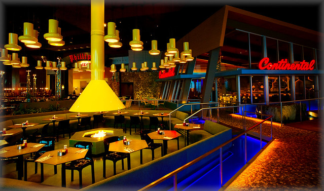
This is one of my favorite restaurants, Continental. I have been to both locations in Philadelphia and the Atlantic City one as well. It is a Stephen Starr restaurant and not only does it have great food but it also has an awesome decor and atmosphere. (I especially LOVE the chandelier at the midtown location!)
Midtown:
Atlantic City:
Midtown:
Atlantic City:
Wednesday, January 19, 2011
Gummy Bear.
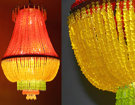
Gummy Bear chandelier:
Another Gummy Bear chandelier:
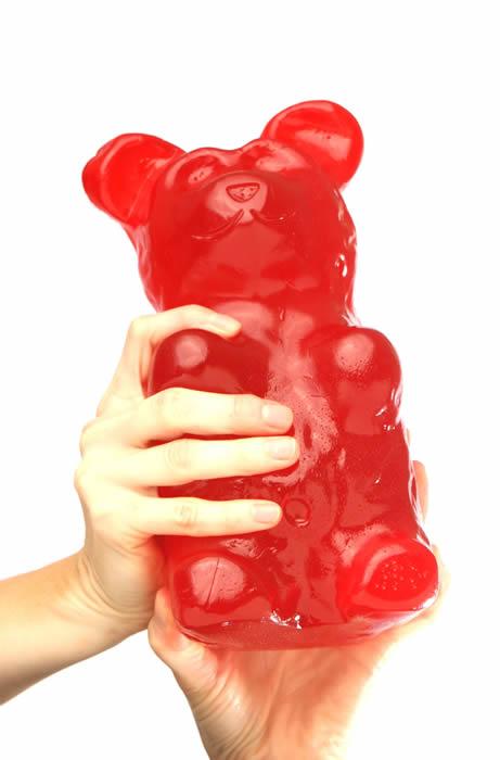
Huge Gummy Bear:
Gummy Bear rings:
And for good measure, the anatomy of a Gummy Bear:
Another Gummy Bear chandelier:
Huge Gummy Bear:
Gummy Bear rings:
And for good measure, the anatomy of a Gummy Bear:
Tuesday, January 18, 2011
Day & Night
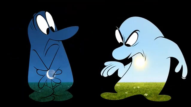
No, no, I am not talking about the Kid Cudi song, although that is good too! I am talking about the Pixar digital short that was before Toy Story 3 in theaters. I thought it was very creative how they depicted the world in daytime and nighttime within the bodies of these two characters. This quite possibly is one of my favorite shorts.
First, take a look at the VIDEO (sorry, although there is no talking the end title is in another language, this is the only full version embedding video I could find):
Video - Day And Night - Pixar
Also, take a look at this CLIP of the making of the short.
Here are screen grabs of some fun scenes from the short:
Check out my blog, Creative Exploration!
First, take a look at the VIDEO (sorry, although there is no talking the end title is in another language, this is the only full version embedding video I could find):
Also, take a look at this CLIP of the making of the short.
Here are screen grabs of some fun scenes from the short:
Check out my blog, Creative Exploration!
Monday, January 17, 2011
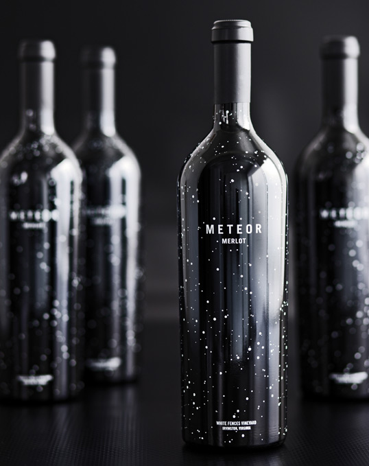
Meteor.
Can we pretend that airplanes in the night sky are like shooting stars?
Ok ok, I'll stop singing to myself. Saw this over on Lovely Package the other day and I really love the look.
The wine is called Meteor Merlot.
If you are viewing this on Facebook, be sure to check out my blog "Creative Exploration".
Ok ok, I'll stop singing to myself. Saw this over on Lovely Package the other day and I really love the look.
The wine is called Meteor Merlot.
Sunday, January 16, 2011
Saturday, January 15, 2011
Illustrated Recipes.
I just stumbled this blog called "They Cook and Draw". I LOVE this style of mixed media which you can see in some of these. All together, there is some great illustration going on here. From the small bit I read on the blog so far, it began with a couple who planned to illustrate a cookbook. It turned into a blog instead and other people can submit illustrated recipes now! They are so fun, creative and full of life. It really ads character to the recipes! Here are a few to check out:
...oh my goodness I could go on and on....this blog is exciting me more and more that I look at it!!
If you are viewing this post on Facebook, check out my blog Creative Exploration!
Friday, January 14, 2011
Balloon Dog.
I have blogged about Jeff Koons before, and I really love some of his art - especially what he calls the "celebration series" in his online portfolio. I seriously like the colors he uses and some of the subjects are so fun. It is cool to see things larger than life in the most unsuspecting places. Anywho, a few months back I saw that Urban Outfitters was selling an metallic inflatable dog ornament that looked just like Koon's Balloon Dog installation art. I thought about buying it, but decided to wait until after the holidays and of course it is sold out now! However, I was pretty disappointed to see that they didn't give him any credit, as it was clearly a replica of his art. I agree that no-one has the "rights" to the shape of a balloon dog, but they were metallic looking just like his art. Just a few days ago I saw on one of the blogs I follow, a metallic balloon dog "bank". Once again, it looks very similar to Koon's work, but has no credit given to him. And, as cute as it is - I don't find it worth buying as it is just shy of a $100 - whhaaa?
Take a look for yourself:
Take a look for yourself:
My Photo from the MET
The Balloon Dog Bank
The Balloon Dog Ornament
Thursday, January 13, 2011
Wednesday, January 12, 2011
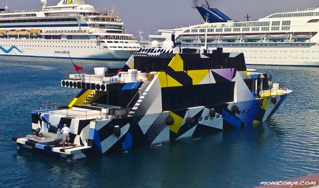
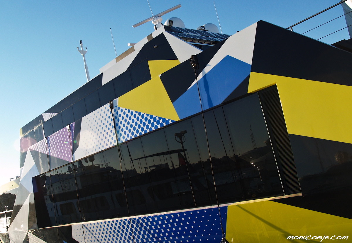
From BMWs to Yachts.
I Just came across this yacht that Jeff Koons designed for a Greek billionaire. HERE is the website I found the article and images. I posted about Jeff Koon's BMW art car design in June HERE. Take a look at the yacht. I think it is fun, they mention in the article that it has a Lichtenstein feel to it which I agree. I see a little 80's-ish look to it as well. I think it is cool, definitely art on water!
Subscribe to:
Comments (Atom)


